If you’ve searched for “AI logo animation” in July 2026, you’re not alone. Google Trends shows breakout interest in the topic, and for good reason: making your logo move is more accessible than ever. But this explosion of new tools, from single-purpose animators like LogoMotion AI to advanced features in video platforms, creates a new problem: choice paralysis. More importantly, it creates the risk of brand mismatch.
An animation isn't just a cool effect; it's a message. The way your logo moves communicates personality, values, and positioning. A frantic, glitchy animation can make a luxury wellness brand feel cheap and chaotic. A slow, elegant fade-in can make a disruptive tech startup feel dated. Getting it wrong undermines your brand before a customer reads a single word.
This guide is a visual glossary for brand builders. We'll define four core animation styles, explain the brand attributes they communicate, and show you how to test and create them strategically on MyUP.ai. The goal isn’t just to make your logo move—it’s to make it move with purpose.
Style 1: The minimal reveal — for clarity and confidence
This is the most classic and versatile style. It’s defined by what it lacks: complexity. Minimal reveals use simple, clean motion like fades, wipes, subtle slides, or gentle scaling to bring the logo on screen. The focus is entirely on the mark itself, presented without distraction.
Brand Fit: This style communicates elegance, professionalism, and confidence. It’s a perfect match for:
- Luxury and high-end consumer goods
- Professional services (consulting, finance, legal)
- Minimalist tech and SaaS brands
- Wellness and healthcare companies
A minimal reveal says, “We don’t need theatrics. Our brand speaks for itself.” It’s a quiet, assured introduction that builds trust and feels premium.
How to create it in MyUP: This is easily achieved with a straightforward prompt. After uploading your logo to your MyUP Brandkit, you can use a simple instruction in the video generator like, “Animate my logo with a slow, clean fade-in on a plain background.” The key is to use simple, direct language. The AI understands concepts like 'minimal' and 'elegant'. The user provides the strategic direction; MyUP handles the production. To see how a minimal logo can fit into a larger design, try this workflow.
Workflow code: #myup-fy77-jljs
Minimalist Elegant Product Advertising Poster
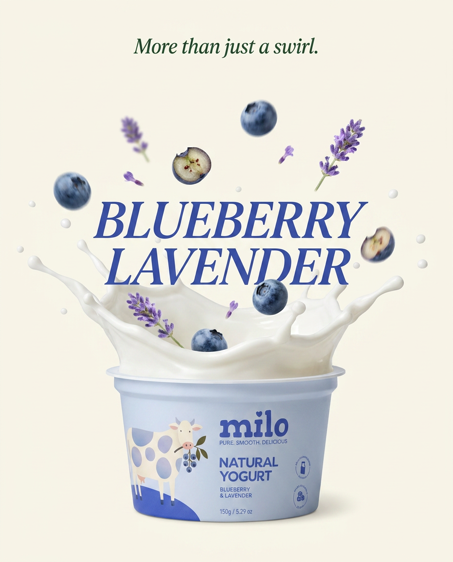
Turn any product shot into a high-end editorial ad. It places your item against a soft cream background with airy spacing and adds elegant, small serif typography at the top. Great for wellness or luxury brands wanting a calm, minimal aesthetic.
Regenerate using your own assets.
Style 2: The energetic build — for tech and innovation
This style, also known as a “construct” or “assemble” animation, shows the logo forming piece by piece. Lines might draw themselves on, shapes might click into place, or elements might fly in from off-screen to form the final mark. The motion is typically sharp, precise, and fast-paced.
Brand Fit: The energetic build is all about process, precision, and technology. It’s ideal for:
- Tech startups and software companies
- Engineering, architecture, and construction firms
- Automotive or manufacturing brands
- Gaming and esports companies
This style visually represents the idea of building, creating, or solving a complex problem. It communicates innovation, dynamism, and technical expertise. Each moving part suggests a well-engineered system coming together.
How to create it in MyUP: For this style to work, you need a clean, high-resolution version of your logo, preferably a PNG with a transparent background, saved in your MyUP Brandkit. This ensures the AI can isolate the individual elements. Your prompt can then be more specific: “Animate my logo assembling piece by piece with sharp, energetic digital transitions.” or “Animate the lines of my logo drawing themselves on screen quickly.”
Style 3: The organic morph — for wellness and creativity
Instead of sharp lines, the organic morph uses fluid, liquid-like motion. The logo might appear as if it’s made of water, ink, or paint, flowing and settling into its final shape. The transitions are smooth, seamless, and often have a natural, unpredictable quality.
Brand Fit: This style feels human, adaptable, and natural. It’s a strong choice for:
- Wellness, beauty, and natural product brands
- Food and beverage companies
- Creative agencies and art-focused businesses
- Environmental and sustainability-focused organizations
The organic morph communicates flow, creativity, and a connection to the natural world. It feels less corporate and more personal, suggesting adaptability and a human touch. The challenge is ensuring the motion doesn't warp your logo beyond recognition, a common problem with less-controlled AI animators. For more on this, see our guide on how to animate your logo without distorting your brand.
How to create it in MyUP: Prompting for this style involves using descriptive, textural words. Try prompts like: “Animate my logo revealing itself with a smooth, liquid morphing effect, like a drop of ink in water.” or “Create a logo animation with a gentle, flowing, watercolour-style reveal.”
Style 4: The digital glitch — for disruptive and edgy brands
The digital glitch embraces imperfection. It uses effects like datamoshing, RGB splitting, scan lines, and static to create a disruptive, high-energy reveal. The motion is intentionally jarring, fast, and chaotic, mimicking the look of a corrupted digital file or a bad broadcast signal.
Brand Fit: This is a bold, confident style that should be used carefully. It’s a perfect fit for brands that are:
- Unconventional and anti-corporate
- Involved in gaming, cybersecurity, or electronic music
- Streetwear or alternative fashion labels
- Any brand positioning itself as a challenger or disruptor
The glitch style screams “digital-native.” It’s energetic, modern, and a bit rebellious. It can instantly position a brand as being on the cutting edge, but it can just as easily feel out of place and alienating for a more traditional or conservative brand.
How to create it in MyUP: This style benefits from layered, descriptive prompts. You can combine multiple effects in one request: “Animate my logo with a dynamic reveal featuring digital glitch effects, flickering scan lines, and a subtle RGB split.” This gives the AI multiple visual cues to work with, resulting in a more textured and intentional effect. Use this workflow for a poster that fits a similar edgy brand identity.
Workflow code: #myup-xbur-hzoi
Bold Retro Yellow Event Poster
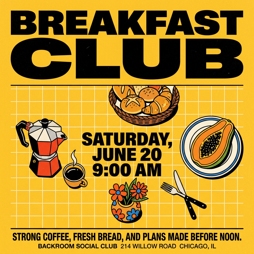
Turn your branding or event details into bold, nostalgic posters. It blends vibrant warm backdrops with a clean, retro square grid pattern to make any announcement look like a classic piece of mid-century graphic design.
Regenerate using your own assets.
From style choice to finished ad: your workflow in MyUP
Choosing a style is the strategic part. Executing it—and then actually using it—is where an integrated platform like MyUP makes the difference. A single-purpose tool might give you a GIF, but that’s a dead end. The real value is making your animated logo a reusable asset for all your marketing content.
Here’s the simple, repeatable workflow:
- Centralize Your Logo in a Brandkit: Before you do anything, upload your official logo (as a high-resolution transparent PNG) to your MyUP Brandkit. This is your single source of truth. Every workflow you run will automatically pull the correct, on-brand logo, ensuring consistency and quality without you having to find and upload the file every time.
- Test and Iterate on Styles: Use MyUP's AI Video generator to experiment. Run the same logo through different prompts based on the styles above. Try “a minimal fade-in” and then “an energetic build.” In minutes, you can generate several options. This is where your control comes in: you validate the results and choose the one that best fits your strategy.
- Deploy Your Animated Logo into Content: This is the step other tools miss. Once you’ve generated an animated logo you love, you can immediately use it as an element in any other MyUP template. Let’s say you’ve created a beautiful organic morph animation for a new juice drink. You don’t just download it; you apply it directly to a video ad.
This workflow for a social media ad is the perfect place to drop in your new animation. It shows how the animated logo isn't the final product, but a key ingredient in your larger content strategy.
Workflow code: #myup-cqnu-i50m
Drink Product Ad
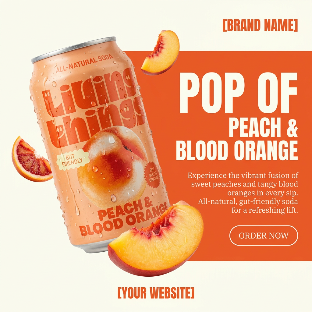
Turn any product photo into a bold, modern ad poster. It automatically frames your item against a split-color background, pairing a clean cream tone with a solid block of your product's dominant color. Super clean, minimal, and ready for social feeds.
Regenerate using your own assets.
